Tailwind CSS + Hugo | Step 3 – Adding some basic content.
I added some basic content to the site index page tonight.
I don’t want to design the layout in isolation from the content. Real content allows me to do this piece by piece, and gives me some confidence in my approach.
Yes I could pre-plan this, and I’ve flip-flopped on writing up a design doc on this before doing any more work. However, what this would contain is beyond the horizon, and I fear I’d remain static.
Step 4 in this series will be for me to define the goals of this project. As I progress through the steps, some of which will be tiny, I can check progress against these goals.
I took one of those tiny steps tonight, by adding some content to the main page.
To do this I modified layouts/index.html:
{{ define "main" }}
<div class="post-listing">

{{/* paginate all posts in the archive section of the content */}}
{{ range where .Paginator.Pages.ByDate.Reverse "Section" "archive"  }}
    <section>
        <p>{{ .Title }}</p> {{/* display the post title */}}
        <p>{{ .Date }}</p>  {{/* display the post date */}}
    </section>
{{ end }}

</div>
{{ end }}
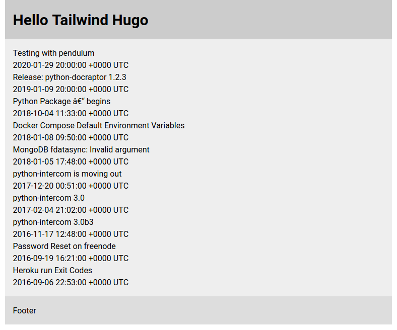
And this is how the site looks with this change in place:

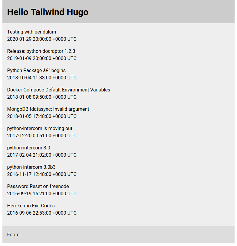
As expected it’s a very cosy in there, with little room to breath. A temporary CSS rule will make things that a bit more airy.
.post-listing section {
  padding-bottom: 1em;
}
Check out the live site at https://tailwind.keyes.ie.
Until next time, bí cúramach.
