Tailwind CSS + Hugo | Step 2 – Create a Basic Layout
It’s been a while since Step 1 but I’ve finally come back to have a little further exploration with Tailwind.
After Step 1, I had a very very basic site in place, so I decided it’s time to create a basic layout.
I’ve decided not to be very adventurous to start-out, and so I stick with the single column layout I currently have on the site, along with three main sections of content.
- a header
- a main content / post section
- a footer
Let’s see what was involved in achieving this.
The CSS
I followed the recommendation of the official docs to Add Tailwind to your CSS.
I created themes/tailwind-keyes/assets/style.css and entered the three tailwind directives:
@tailwind base;

@tailwind components;

@tailwind utilities;
and then call the Tailwind CLI to convert this into CSS in the theme:
npx tailwindcss build \
    themes/tailwind-keyes/assets/style.css \
    -o themes/tailwind-keyes/static/css/style.css
With the CSS now generated, we can link to it from our HTM by adding the following link tag to the head.html partial:
<head>
  <link
    href="{{ .Site.BaseURL }}css/style.css"
    type="text/css"
    rel="stylesheet"
  />
</head>
The Layout
Now to implement the basic single column, three section layout I mentioned earlier.
The following the _default/baseof.html layout:
<!DOCTYPE html>
<html>
  {{- partial "head.html" . -}}
  <body>
    <div class="container mx-auto">
      <header id="header" class="p-4">
        {{- partial "header.html" . -}}
      </header>
      <div id="content" class="p-4">
        {{- block "main" . }}{{- end }}
      </div>
      <footer id="footer" class="p-4">
        {{- partial "footer.html" . -}}
      </footer>
    </div>
  </body>
</html>
There are three partials involved here:
head.htmlis included immediately inside<html>. This is where out<link>element and other page front-matter will be defined e.g.<meta>tags,<title>etc.header.htmlis the page headerfooter.htmlis the page footer
There is also the main block. This is replaced by the page specific content template e.g. the index template will be different to the single template.
The header and footer partials, and the main block are all descendents of the container div. This is the first tag where we use Tailwind.
Here we are saying we want this <div> to be a Container for the rest of the content, and we want it to use an automatic margin, to centre the container in the viewport.
The only other Tailwind references in this file are where we use some generous padding for each section to give the content some breathing space, by adding the p-4 class.
Header
The header partial is very basic:
<h1 class="text-3xl font-bold">Hello Tailwind Hugo</h1>There’s a single <h1> tag, and we use some Tailwind classes to make the text large by using the text-3xl class, and the font-bold class controls the font weight.
Main Content
For now this theme is fosued on the home page, so the content in the main block is being supplied by the index.html template.
This is what is in that file:
{{ define "main" }}
<p>Main content</p>
{{ end }}
Nothing to see here, let’s move on quickly :)
Footer
You may have gotten into the swing of things by now, and I’m sure you realise that the footer.html partial is going to be … yep very simple:
<p>Footer</p>Sprinkle some colour into the backgrounds
To complete this step of the work, I added background colours to each section, to clearly separate them on screen.
In the style.css file I added the following rules after the Tailwind directives:
#header {
  background-color: #CCC;
}
#content {
  background-color: #EEE;
}
#footer {
  background-color: #DDD;
}
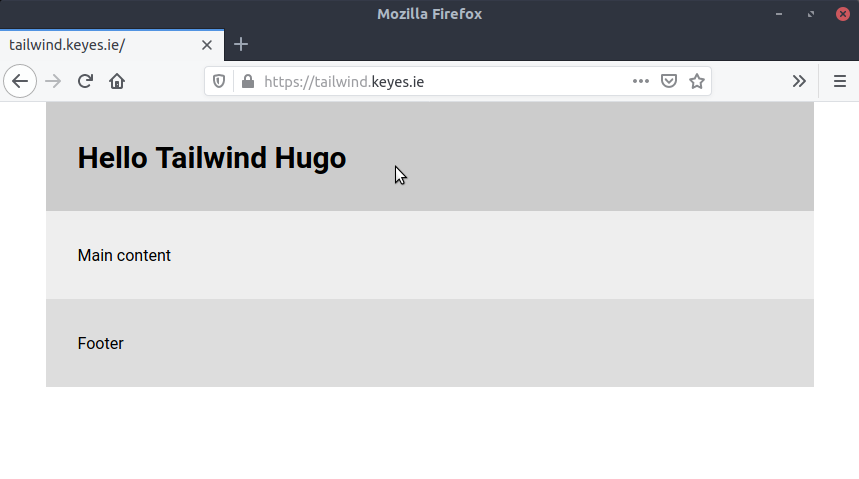
And I say the magic word and … voila
This is the end result of all that waffling:

And that concludes Step 2, I’m thinking what I look at next is a step to remove all the unused CSS rules to minimise the CSS being loaded by the browser.
This isn’t a particularly pressing issue, but given I’m just doing all this to learn a bit more about things’n’stuff, I don’t see why I shouldn’t tackle it next :)
Mind yourself.
